Foundations
Colour
Three Tailwind families, each with a meaning: slate is space, amber is the moon, teal is the nebula. Nothing outside these three. Click a swatch to copy its hex.
Slate · Space
Amber · The moon
Teal · The nebula
- Default ground is paper (amber-50); alternate light sections with paper-deep (slate-50).
- Ink (slate-950) is the text and the dark bands. At most three ink bands per page.
- Amber is the focal point: one amber thing per screen. Text on amber is ink, never white.
- Teal is the second voice: illustration details, tags on ink, icons. It never fills a primary button, and never sits next to an amber focal point.
- The teal-200 highlighter goes behind one short phrase per page.
Colour roles
Components use roles, never raw palette names or hex values. Each role points at one palette colour.
| Role | Palette | Use |
|---|---|---|
paper | amber-50 | Page background, default section ground |
paper-deep | slate-50 | Alternating light sections, docs screens, inline code |
ink | slate-950 | Text and headings; hero, proof bar and closing bands |
ink-soft | slate-800 | Secondary text on light grounds |
line | slate-300 | Card borders and dividers. Decorative only |
accent | amber-600 | Primary buttons, proof numbers, moon fills. One focal point per screen |
accent-soft | amber-100 | Badges, tint fills, a single featured block |
accent-ink | slate-950 | Text on accent. Never white |
star | amber-100 | Text and the moon on ink |
star-dim | slate-300 | Secondary text and outlines on ink |
highlight | amber-600 | One badge or callout per view that must jump out |
highlight-soft | teal-200 | Highlighter behind a short phrase, once per page |
nebula | teal-400 | Secondary accent on ink: illustration details, tags |
nebula-deep | teal-600 | Secondary accent on light grounds: icons, rules, large text |
Contrast
WCAG 2 ratios, computed from the palette. 4.5:1 for text, 3:1 for large text, icons and control edges.
Foundations
Typography
Two Google Fonts. Funnel Display does the talking; VT323 does the counting.
Funnel Display
Aa Bb 700
Medium 500
Light 300
Headings Bold 700. Body Light 300. Buttons, labels and any bold text Medium 500.
VT323
23.5K
SHIP IT · WEEK 3
Labels, numbers, dates, prices. Never paragraphs, never below 18px.
display-hero
Funnel Display Bold 700 · 72px / 1.02 · −0.025em
One person can run the whole ship.
display-page
Bold 700 · 60px / 1.05
Six weeks. Six ship logs. One live URL.
heading-section
Bold 700 · 36px / 1.25
Building got cheap. Shipping didn't.
heading-card
Bold 700 · 20px / 1.4
An invariants file
lead
Medium 500 · 20px / 1.5
We each built and launched a product alone, with AI as our crew.
body
Light 300 · 17px / 1.6
Every gotcha written down the day it bites, so neither you nor the AI repeats it.
button
Medium 500 · 16px / 1.5
Join the waitlist
eyebrow
VT323 · 20px · uppercase · 0.06em · 70%
Why most projects never leave the dock
stat
VT323 · 56px / 1
23.5K
meta
VT323 · 20px / 1.3
week 3 · 15 October 2026
Foundations
Spacing and radius
Sections breathe. Content stops at 1152px. Corners are soft but never pills.
radius-sm
4px · Badges, inline code
radius-control
12px · Buttons, inputs, chips. Never a pill
radius-card
16px · Cards, pricing, tiles
Brand
Logo
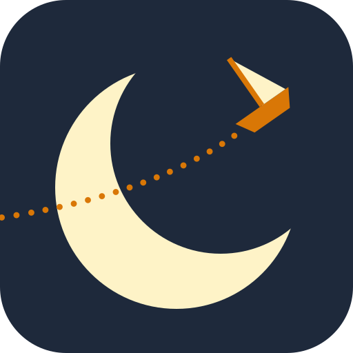
The stacked lockup: one / small / ship in Funnel Display Bold, lowercase, with “to the moon” in VT323. The mark is the moon and the small ship on its dotted flight path.
one
small
ship
to the moon
one
small
ship
to the moon

The mark: app icon and favicon
- Always lowercase. Always stacked, except the single-line nav version.
- Ink on light grounds, star on ink. On ink, “to the moon” may take amber.
- “to the moon” belongs to the lockup only. Taglines everywhere else come from the Voice section.
- Clear space on every side: the height of the “o”.
- The tagline line is optional when the lockup is under 120px tall.
- Never recolour to teal, never stretch, outline, shadow or rotate it.
Wordmark files
Type converted to outlines, so the SVGs work without the fonts installed.


Brand
Marks
Slate-800 is the primary dark; ink is the alternate, used where the surroundings are already ink. On dark grounds the moon is paper and the ship is amber with a paper sail. On light grounds the moon takes the dark colour and the whole ship is amber.


- Stars only at large sizes (64px and up): avatars, covers.
- Earthshine, the paper crescent with the rest of the moon in slate, sits on ink only. It is the homepage header look.
- Below 32px the trail disappears and the mark reads as the crescent with a small amber ship. That is expected.
- One-colour marks are for embroidery, foil, stamps and single-colour print.
Favicons and app icons






Brand
Voice
Two people who ship, talking to one person who wants to. Plain words, real specifics, no theatre.
We, to you
Sophie and Heidi talking to one reader. Casual, plain words, fragments allowed. Many readers are Finnish, reading in their second language.
Values quiet, product loud
We never call ourselves ethical or honest. Ship logs, live URLs and sourced numbers say it for us.
Basics, said with enthusiasm
The fundamentals are the exciting part. Our advice is never a hack, a secret or a trick.
Specific beats impressive
Name the exact frustration, then the exact fix. Numbers carry a source and a date. Shipping and distribution, never revenue.
Persuade like you're watched
No fake urgency, scarcity or guilt. If we'd be embarrassed for the reader to see how we wrote it, we rewrite it.
Rules, not reminders
We don't chase. State a rule once, plainly, and let it do the work.
Sympathy for the reader
Hack-brain isn't stupid. Blame the hype that sold it, never the person.
Dry, never smug
Self-aware humour, mostly in microcopy. Never at the reader's expense.
Taglines
The name is clever, so the line beside it has to be clear. A starting set, revised after positioning.
Build your product. Launch it. Get it found.
Main line: footer, link previews, covers, banners
Helping solo builders build useful products and get them found.
Profile headlines, bios, meta descriptions
For marketers learning to build, and builders learning to market.
Explaining the two tracks
Ship something useful every week.
Homepage hero, Ship It, cohort posts
| Say | Not |
|---|---|
| You build for months. Nobody finds it. | Unlock your product's full growth potential. |
| We won't chase you. The rules do. | Our supportive community will keep you motivated! |
| 23.5K Copilot citations in six months, €0 on ads. | Massive AI visibility, guaranteed. |
| Ship something useful every week. | Join the ethical indie movement. |
| Applications close on [date]. | Hurry, spots are filling fast! |
| Join the waitlist | Learn more |
Banned words
Brand vocabulary, used sparingly
- Ship It
- The cohort (never "Ship or Die")
- Ship log
- Weekly public check-in
- Launch window
- Enrolment period
- Go/No-Go
- A validation gate
- To the Moon Day
- Demo day
- Ground control
- Sophie and Heidi
- Mission patch
- A milestone badge
Brand
Illustration
The same ship, dotted flight paths and faint stars as the mark, on dark or light grounds.
On dark · slate (primary)


On dark · ink (alternate)


On light · slate


On light · ink


- The moon is always paper on dark grounds. The ship is always amber, with a paper sail on dark and an amber sail on light.
- On light grounds the moon takes the dark colour (slate or ink) whenever a ship is in the picture. With no ship, the moon may be amber, as in the steps on the site.
- Trails are round amber dots that leave the ship from behind the hull, along its heading. The path still to fly is faint.
- Space as atmosphere, not sci-fi: moons, dotted trajectories, a few stars.
- No rockets, astronauts, galaxies, the rocket emoji, NASA-style insignia or film franchise references.
- Hand-drawn line work and risograph grain are welcome. 3D renders and stock photos are not.
Brand
Icons
Lucide, one line-based set at a 1.5px stroke. Icons take the text colour; use words before icons, and never emoji as section markers.


Brand
Moon phases
The moon is the brand's progress bar. Lit area in amber, outline in the current text colour at 35%.
0%
25%
60%
100%
- How-it-works steps use 25%, 60% and full.
- Cohort weeks fill toward a full moon on To the Moon Day.
- League standings and ship logs use the same device.
Components
Cards
For parallel, comparable things only. 16px corners, a line border, no shadow.
Indie · Build
Marketers who want to build
You know the customer. You've never shipped software.
Components
Steps
“How it works” is always exactly three steps, numbered with moon phases.
- 01
Pick your track
Your own product, or your team.
- 02
Get the system
Templates, prompts and Claude skills.
- 03
Ship it
A live URL on To the Moon Day.
Components
Proof bar
Three or four numbers in VT323, amber on ink, with one source line. No source, no number.
2.5M
times Plumerie showed up in search, in 6 months
1,000+
people using Plumerie, €0 spent on ads
5.25M
Google impressions for Heidi's Finnish content site, in its first year
10,000+
Hot Girl Steps downloads, no ads
Plumerie: Google Search Console and Bing Webmaster Tools, May – Oct 2026; users Nov 2026. Heidi's Finnish content site: Google Search Console, 12 months to 7 Nov 2026. Hot Girl Steps: downloads as published on heidisuutari.com, Nov 2026.
Components
Pricing cards
Free first. One highlighted card per grid, on ink, with the primary button.
Everyone
Free
€0
Free forever. No signup needed to read.
- Every guide, glossary entry and blog post, ungated
- Indie League: the public leaderboard of who shipped what, open to read
Teams
Workflow diagnostic
€450
A 90-minute call with your team lead. If you book a workshop, the fee comes off it.
- Three of your team's workflows, ranked for AI
- The workshop format we'd recommend, and why
- Credited in full to a workshop
Indie builders
Ship It
€19
Lifetime access. The price goes up €10 every 10 seats and stops at €299. 10 seats left at this price.
- Six-week cohorts, online and async. The first starts 11 January 2027
- The OS pack: every template, prompt and Claude skill we use
- Two subtracks: Build (your first product) or Get Found (people find the one you have)
- The League: weekly ship logs, a leaderboard and To the Moon Day
- A community of people shipping at the same time
- Every future cohort, included
Components
Badges and highlighter
Small emphasis. Badges in VT323 on amber-100; the amber badge and the teal highlighter are rare.
Miss two ship logs and you move back to the free tier. Ship again and you’re back.
Components
Waitlist form
The site's one conversion point. Track choice, first name, email, one button, one small promise.
Brand
Link previews and social profiles
Built from the mark as it is: same moon, ship and trail. In wide formats the trail carries on along the line it was already on.
Link previews · 1200 × 630
Profile photos · 1080 × 1080
LinkedIn covers · 4200 × 700
Facebook covers · 1640 × 624